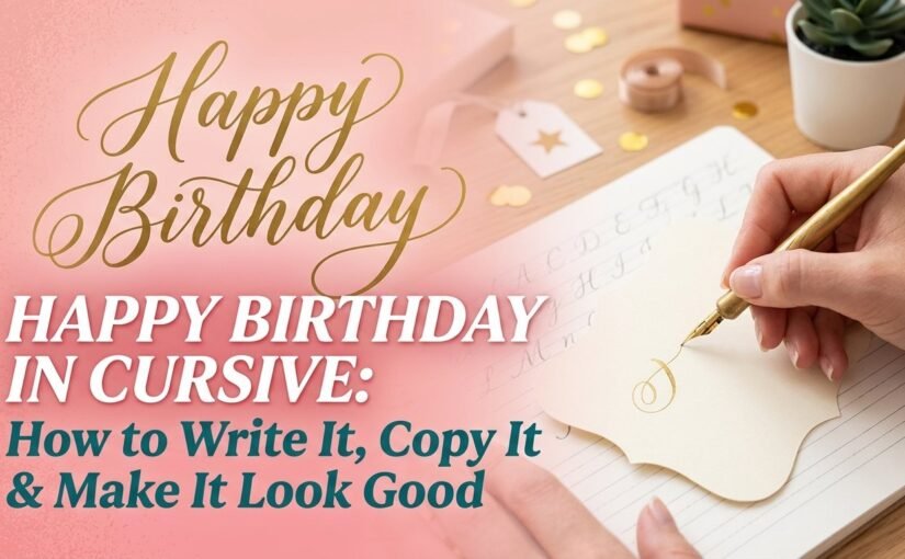
Most people who type “happy birthday cursive” into a search bar want one of three things: to write the words by hand on a card or cake, to copy-paste a fancy-looking version into a message, or to find a font they can use in a design. This guide covers all three, starting with the handwriting itself.
The Quick Answer
To write “Happy Birthday” in cursive by hand, keep your pen on the paper through each word, lean every letter in the same direction, and lift only to dot the i and cross the t once the word is finished. To get it on a screen instead, copy the script-style text below or pick a cursive font in your design app.
Copy-paste version: 𝓗𝓪𝓹𝓹𝔂 𝓑𝓲𝓻𝓽𝓱𝓭𝓪𝔂
How to Write Happy Birthday in Cursive by Hand
Think of the phrase as two connected shapes rather than fourteen separate letters. The trick is rhythm: the same loops, ovals and upstrokes repeat, so once your hand finds the pattern, the whole phrase flows.
Before you start
- Use a pen that glides. Gel pens, fineliners and soft pencils forgive more than ballpoints.
- Draw a light baseline in pencil if your lines drift. You can erase it afterwards.
- Tilt the paper slightly so your pen moves in a comfortable arc.
Writing “Happy”
- The H. Capital H is usually the trickiest letter in the phrase. Most cursive styles build it in two strokes: a tall, curved stem first, then a lifted pen for the second stem and crossbar. Take your time here, because a wobbly H sets the tone for everything after it.
- The a. Make a counterclockwise oval, close it neatly at the top right, and exit with a small upstroke that leads into the next letter.
- The two p’s. Each p reaches below the baseline and returns to it before joining onward. Aim to make the second p a twin of the first. This pair is where uneven spacing most often creeps in.
- The y. It finishes below the baseline with a loop or tail. Since it ends the word, this is a good place for a little flourish.
Writing “Birthday”
- The B. Start with the tall stem, then add the two bowls in one flowing line, or lift briefly if the style you learned uses two strokes.
- The i. A short upstroke, a downstroke and a small swing out. Leave the dot for later.
- The r. Keep its small shoulder low and compact. A tall, loose r is easily mistaken for a different letter.
- The t. It stands taller than the vowels but shorter than the h and d. Cross it later.
- The h. A tall loop, then a rounded hump before the exit stroke.
- The d. Begin like an a, then pull the stem up tall and come back down along it.
- The y. Finish with the same tail you used in “Happy” so the two words feel related.
Finishing touches
Once both words are down, go back and dot the i and cross the t. Doing it after the word, not mid-word, keeps your line unbroken and your lettering smoother. Leave a gap between “Happy” and “Birthday” roughly the width of one letter.
Capital B or Lowercase b?
Both are correct. In a greeting, “Happy Birthday” is usually written with both words capitalized because it works like a title. If it sits inside a longer sentence, such as “Hope your birthday is lovely,” the lowercase b is the right choice. Lowercase cursive b is also easier to connect, so beginners sometimes find it more forgiving.
Common Mistakes That Make Cursive Look Messy
- Inconsistent slant. Letters that lean in different directions are the biggest giveaway. Pick one lean and hold it.
- Lifting the pen mid-word. Every unnecessary lift breaks the flow. The H and B are the usual exceptions.
- Closed-up loops. If your a and d look like o’s, open the top slightly so the stem has room to rise.
- Cramped letters. Too tight and the word becomes a ribbon. Give each letter a little breathing room.
- Dotting the i too early. It slows you down and disrupts your rhythm.
- Forgetting the baseline. Letters bobbing up and down is almost always a baseline problem.
Tips for Left-Handed Writers
Left-handers often smudge as the hand drags across fresh ink. Quick-drying gel or fine pencil helps. Many left-handers also find that an upright or very slightly leaning style feels more natural than a strong rightward slant, and that is perfectly fine. Consistency matters more than any particular angle.
A Short Practice Routine
- Warm up with shapes. A row of ovals, a row of tall loops, a row of connected humps.
- Practice the hardest letters alone. Write capital H and B a dozen times each.
- Write the full phrase slowly. Then write it a little faster. Compare lines and keep the one with the most even rhythm.
How long it takes to feel comfortable varies from person to person. A few short sessions are usually enough to make a visible difference for one phrase.
Copy and Paste Cursive Happy Birthday
If you just need a script-style line for a text, caption or story, you can paste this:
𝓗𝓪𝓹𝓹𝔂 𝓑𝓲𝓻𝓽𝓱𝓭𝓪𝔂
It looks like a font, but it isn’t one. It’s a set of Unicode symbols designed for mathematics, and apps display them as ordinary characters. That brings some limits worth knowing:
- Some older devices and apps show empty boxes instead of the letters.
- Screen readers may read them oddly, or skip them. Avoid using them for anything people need to read accessibly.
- They don’t scale or print like real fonts. For a card, banner or printable, choose a real font instead.
Cursive Fonts That Suit Happy Birthday
These are free, widely used script fonts on Google Fonts. Each has a different personality, so test your exact wording before choosing. Licence terms can change, so check the current one before using any font commercially.
- Great Vibes: formal and flowing with fine hairlines. It suits milestone birthdays and invitations.
- Dancing Script: bouncy and friendly. A good default for casual cards and social posts.
- Pacifico: thick, brush-style and retro. Works best on bright party graphics.
- Allura: elegant and light, similar to formal lettering on stationery.
- Sacramento: thin, single-weight line. It looks modern and works well on photos.
- Satisfy: relaxed brush script that feels handwritten without being fussy.
Two design rules that save a lot of frustration: don’t set script fonts in all capitals, because the letterforms were designed to connect and become hard to read when separated. And pair the cursive line with a plain font for the rest of the message so the eye has somewhere to rest.
Related: Cute Birthday Card Ideas: Easy DIY Designs and What to Write
Where to Use Cursive Happy Birthday
On a card. Write “Happy Birthday” large across the front, then use plain handwriting for the message inside. The contrast makes the cursive feel special.
On a cake. Practice on parchment paper first. Icing needs a steady, continuous line, so simplify any flourish you can’t pipe in one smooth pass. Lightly scribing the words with a toothpick before piping can help you plan the spacing.
On a banner or gift tag. Keep the lettering big and the line thick. Thin hairlines vanish at a distance.
On a photo. Place the text over a calm area of the image, and choose a font colour with clear contrast.
What to Write Beneath Your Cursive Happy Birthday
A short line under the lettering turns it from decoration into a message. Here are six to adapt:
- Warm and simple: “I hope today is gentle with you and generous too.”
- Playful: “Yes, I wrote this in cursive on purpose. You’re worth the extra loops.”
- Grateful, for a close friend: “Thank you for every year of being the person I can call at the last minute.”
- For a grandparent: “You taught me what a handwritten note is worth, so here’s one for you.”
- For a colleague: “Wishing you a quiet inbox and a very good cake today.”
- For a child: “Keep the curiosity, keep the laughter, and keep growing exactly your way.”
To personalize any of them, swap in one real detail only you would know, such as a shared joke or a place you both love.
Related: Cute Birthday Cards: 22 Easy Ideas and 130 Sweet Messages to Write Inside
Frequently Asked Questions
Why does my cursive H look different from the one in a worksheet?
Cursive isn’t one single standard. Teaching systems such as Palmer, Zaner-Bloser and D’Nealian use different capital forms, so an H or B from one worksheet can look quite unlike another. Choose one style and stick with it throughout your lettering.
Can I print “Happy Birthday” in cursive?
Yes. Type it in a script font and print it, or write it by hand on paper and scan or photograph it, then print the image. For a handwritten look, scanning at a high resolution on plain white paper gives the cleanest result.
How do I type cursive on my phone?
The simplest option is to paste script-style Unicode text like the example above. For a design with more control, use a design or photo-editing app that lets you choose a cursive font.
Do I need to know full cursive to write this?
No. You only need roughly a dozen distinct letterforms, and many of them repeat across the two words. Learning this one phrase well is a practical way to begin.
Final Thoughts
Writing “Happy Birthday” in cursive is a small effort that makes a card feel more personal. Practice the capital H and B, keep your slant steady, and let the rhythm of repeating shapes do the rest. If you’d rather skip the pen, a good font and a well-chosen line underneath will carry the same warmth.